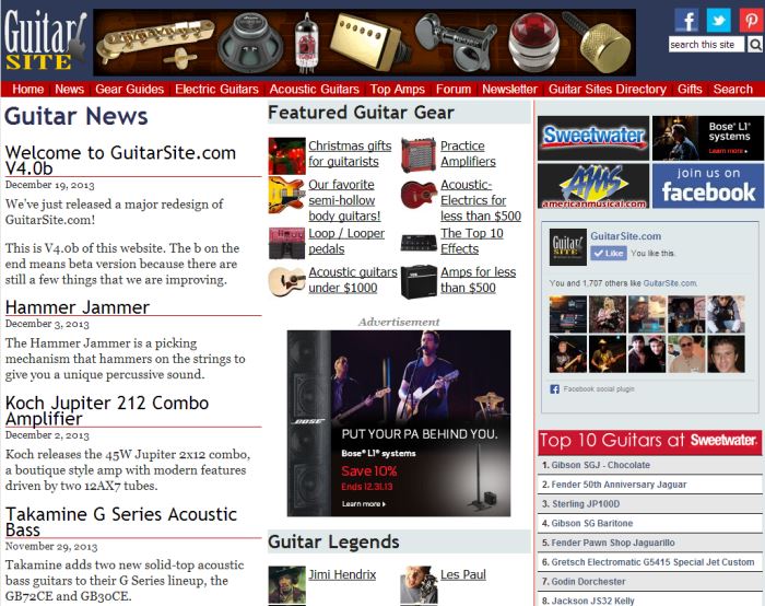
We’ve just released a major redesign of GuitarSite.com!
This is v4.0b of this website. The b on the end means ‘beta’ version because there are still a few things that we are improving.
This new design is intended to work on all types of devices from smart phones through to regular desktop computers. We would appreciate any feedback you have – good, bad, or ugly – in the comments below. If there is something which doesn’t seem right, or if you feel something could be improved, please tell us along with the kind of device you’re using to view the site such as an iPad, laptop, or desktop computer etc.
And now for those of you who are new to GuitarSite.com, here’s a walk down memory lane…
Version 1.0 GuitarSite launched in 1999
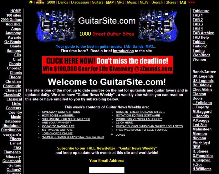
Version 2.0 was unleashed in 2006
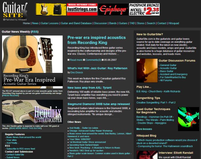
Version 3.0 came online in December 2010

Version 4.0 – Today!
Please leave your feedback and any suggestions you have about improving the new design, in the comments below…
If you’re open to a design suggestion at this point, I would recommend redesigning or even losing the top banner with the small pictures. In my opinion, it gives the page an industrial look, like a parts catalog for an industrial manufacturer.
A second problem created by the banner is that it makes the name “Guitar Site” look squashed into the corner, an issue that is made worse by the image of the guitar leaning on the name.
Between the top banner, the “Featured Gear” section and the social section on the right-hand side, you have too many little pictures, giving the home page an overly busy look.
Thank you very much for your detailed feedback.
We are still considering what to do with the top banner. There are a number of banners in rotation and I think I know which one you are talking about – it is in fact an advertisement for a guitar parts supplier and it does indeed give the page a ‘catalog’ look when it appears.
We’re also looking at ways of improving the “Featured Guitar Gear” section on the front page – we will be trying some different layouts with both the text and images soon.
If you would be kind enough to say what screen resolution you were viewing it on that would help me to understand a little better what the front page looks like when you view it.
Thanks,
Jason.
The new look is a huge improvement of the old site – nice work!
Thank you – we’re glad you like it!